This week we were asked to evaluate hotel guest satisfaction data using the Chi Squared test. The data is separated by the guest’s recreational preference (beachcombers and windsurfers). We were to summarize our findings and determine whether there are 4 or more degrees of freedom.
I ran the following code to add the data to R and run the Chi Squared test on it.
library(ggplot2)
library(tidyr)
# Build a data frame containing all responses
again <- c(rep("yes", 163), rep("no", 64), rep("yes", 154), rep("no", 108))
guest_type <- c(rep("beachcomber", 227), rep("windsurfer", 262))
survey <- data.frame(again, guest_type, stringsAsFactors = TRUE)
# Run the Chi Squared Test on the data
c2test <- chisq.test(survey$again, survey$guest_type)
c2test
That gave me the result:
	Pearson's Chi-squared test with Yates' continuity correction

data:  survey$again and survey$guest_type
X-squared = 8.4903, df = 1, p-value = 0.00357
There is 1 degree of freedom, so there are not 4 or more dfs. The p value is less than 0.05, so the null hypothesis is not supported and we can conclude that the variables are dependent (meaning that recreational preference likely influenced how they answered the survey).
To illustrate this finding, I created bar graphs contrasting the observed results with the results that would be expected if the null hypothesis were true. I retrieved those values from the Chi Squared test result variable.
# For the chart, build a new dataframe that includes the observed and expected totals
c2temp <- data.frame(c2test$observed, stringsAsFactors = TRUE)
c2temp$expected <- c(c2test$expected)
colnames(c2temp) <- c("again", "guest_type", "observed", "expected")
# Use gather() to move results into a single column and create a "data_type" column to use for faceting
c2compare <- gather(c2temp, observed, expected, key="data_type", value="responses", factor_key=TRUE)
# Build a faceted bar chart putting the observed and expected data next to each other
ggplot(c2compare, aes(guest_type, responses, fill=again)) +
  facet_wrap(~data_type) +
  geom_bar(stat="identity") +
  xlab("Guest Type") +
  ylab("Responses") +
  labs(fill="Would return", title="Hotel Guest Satisfaction Chi Squared")
The graph is below.
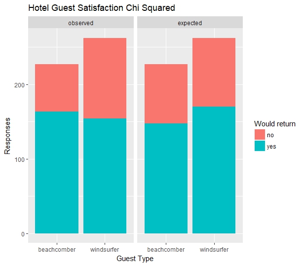
The graph shows that the survey results (on the left) differ from the expected results (on the right).