Final Project – Comparison of arrest trends between genders

For my final project I wanted to look at US crime data from the FBI to see if there are gendered differences in arrest trends. Arrest numbers don’t necessarily reflect actual crime rates (because not all arrests result in convictions), but trends in arrest rates could roughly reflect trends in crime rates. I used the “Arrest Data – Reported Number of Adult Arrests by Crime” data set from the FBI Crime Data Explorer website.

To compare the rates of change in arrests I decided to use the Student’s t-test to compare the slopes of the year-by-year statistics for arrests by gender. The hypothesis tested was that the arrest rates were significantly different between genders, while the null hypothesis was that the arrest rate changes had similar trends between genders (p greater than 0.05).

The first step was to import the data into R, select the data I was interested in, then clean it up to make it easier to work with. The data set includes breakdowns of arrests by year, type of crime, gender, age group, and race. As I was focused on gender, I only kept the year, type of crime, gender, and arrest totals.

library("tidyr")
library("ggplot2")

# Read data on adult arrests downloaded from the FBI Crime Data Explorer:
# https://crime-data-explorer.fr.cloud.gov/downloads-and-docs
# Under "Arrest Data - Reported Number of Adult Arrests by Crime"
raw_crimedata <- read.csv("G:/arrests_national_adults.csv", header=TRUE)

# Extract the columns of interest to this project
gendersums <- raw_crimedata[,c("year", "offense_name", "total_male", "total_female")]
# Make gender a column to make the data easier to plot later
gendersums <- gather(gendersums, gender, total, c(total_male, total_female), factor_key=TRUE)
# Change the factor names in the new gender column to "male" and "female"
levels(gendersums$gender)[levels(gendersums$gender)=="total_male"] <- "male"
levels(gendersums$gender)[levels(gendersums$gender)=="total_female"] <- "female"

That gave me a data frame containing years, offense names, genders, and total arrests for a given year, gender, and offense combination.

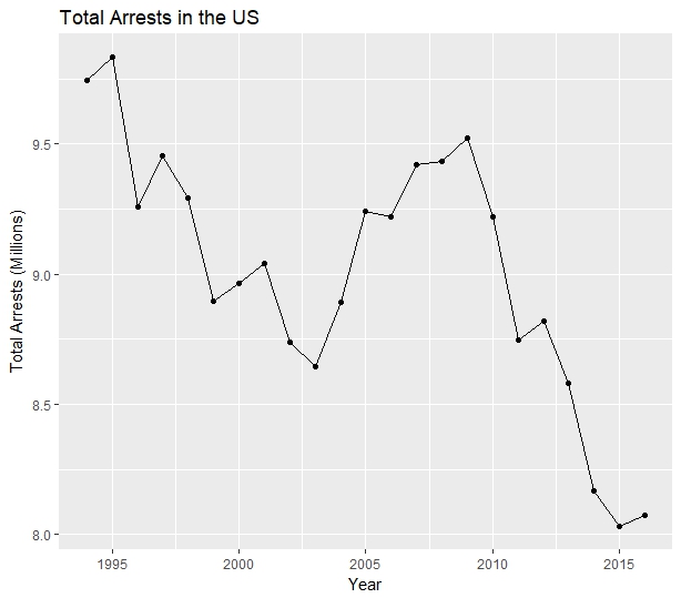
Before looking at the gender breakdown I checked the total arrests for all genders year-by-year.

# Get ungendered arrest totals
ungendered_totals <- aggregate(total ~ year, data=gendersums, FUN=sum)
# Plot ungendered arrest totals
ggplot(data=totals, aes(year, total / 1000000)) +
  geom_line() +
  geom_point() +
  labs(title="Total Arrests in the US", x = "Year", y = "Total Arrests (Millions)")

The resulting graph showed a general downward trend, with total arrests increasing from 2003 to 2009.

Next I created a data frame to hold the total arrests per gender, removing the distinction by offense type. Then I ran a t-test on the data to compare rates of change between male and female arrest totals.

# Get year-by-year totals of all crimes by gender
totals <- aggregate(total ~ year + gender, data=gendersums, FUN=sum)
# Run Student's t-test to compare the arrest totals by gender per year
t.test(total ~ gender, data=totals)

The output of the t-test was:

	Welch Two Sample t-test

data:  total by gender
t = 39.748, df = 26.498, p-value < 2.2e-16
alternative hypothesis: true difference in means is not equal to 0
95 percent confidence interval:
 4660622 5168465
sample estimates:
  mean in group male mean in group female
             6962686              2048142

The p value was extremely low – well below 0.05. For a p value of 0.05 the t value needed to be above approximately 1.7 to be considered significant – the t value was nearly 40. I concluded that the data did not support the null hypothesis, and that there were differences in the arrest rate changes between men and women year-to-year.

That conclusion is borne out by charting arrest totals for males and females and observing their slopes.

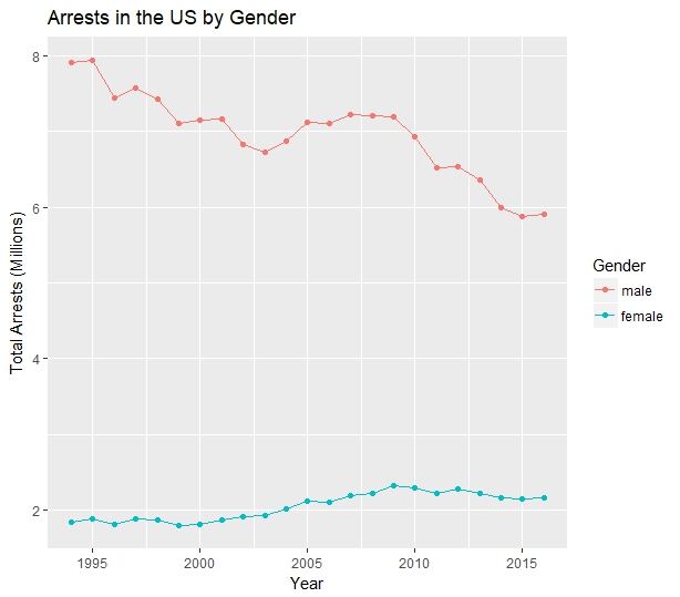
There’s a clear difference in the trends – arrest numbers have dropped for men since 1994, while arrest numbers for women have increased. Crunching the numbers, total arrests for men decreased by 25.2% from 1994 to 2016, while total arrests of women increased by 17.9% over the same period.

I was curious to see which offenses contributed the most to the difference between male and female arrests, so I went a step further in my analysis. I calculated the percentage changes in arrests for each offense type. Then, to narrow the list of offenses to those most likely to have had an impact on the figures, I selected only offenses for which there were more than 10,000 female arrests listed for 2016 and for which the gap between changes for the genders between 1994 and 2016 was greater than 50 percentage points.

The result indicated that the offenses that drove the relative changes in female arrests were burglary, driving under the influence, drug abuse violations, motor vehicle theft, simple assault, vandalism, and uncategorized offenses. I charted those offenses to show the percentage increase or decrease for both genders.

The results are interesting. Some offenses saw very large increases in female offenders (like drug offenses), while others are noteworthy for how much male arrests decreased (like car theft).

The code used to select the offenses to display on the chart above isn’t pretty, but it’s printed below.

# Calculate percentage change by offense type and gender
changes_list <- by(gendersums, gendersums[,"offense_name"], function(x) {
  (x[x$year==2016, "total"] - x[x$year==1994, "total"]) / x[x$year==1994, "total"] * 100
} )

# Make a flat vector of numbers so they can be moved to a data frame more easily
flat_changes <- unlist(changes_list)
# Assign genders to the calculated percentages, then build the data frame
male <- flat_changes[seq(1,length(flat_changes), 2)]
female <- flat_changes[seq(2,length(flat_changes), 2)]
offense <- names(changes_list)
changes <- data.frame(offense, male, female)
# Remove entries where the gap between male and female arrests is less than 50 percentage points
changes <- changes[changes$female - changes$male >50,]
# Make a data frame with 2016 entries where the number of female arrests was over 10k
high_female <- gendersums_wide[gendersums_wide$total_female > 10000 & gendersums_wide$year==2016,]
# Use the intersection of changes and high_female to select the most significantly changed offense types
changes <- changes[intersect(changes$offense, high_female$offense_name),]
changes <- gather(changes, gender, percent_change, c(male, female), factor_key=TRUE)
ggplot(data=changes) +
  geom_col(aes(x=offense, y=percent_change, fill=gender), position="dodge") +
  theme(axis.text.x = element_text(angle = 90, hjust = 1)) +
  labs(title="Change in Arrest Totals in the US from 1994 to 2016", x = "Offense", y = "Percentage Change", fill="Gender")

Thanks for an instructive semester!

Posted in Advanced Statistics and Analytics | Comments Off

Module #11 Chi Squared Test

This week we were asked to evaluate hotel guest satisfaction data using the Chi Squared test. The data is separated by the guest’s recreational preference (beachcombers and windsurfers). We were to summarize our findings and determine whether there are 4 or more degrees of freedom.

I ran the following code to add the data to R and run the Chi Squared test on it.

library(ggplot2)
library(tidyr)
# Build a data frame containing all responses
again <- c(rep("yes", 163), rep("no", 64), rep("yes", 154), rep("no", 108))
guest_type <- c(rep("beachcomber", 227), rep("windsurfer", 262))
survey <- data.frame(again, guest_type, stringsAsFactors = TRUE)
# Run the Chi Squared Test on the data
c2test <- chisq.test(survey$again, survey$guest_type)
c2test

That gave me the result:

	Pearson's Chi-squared test with Yates' continuity correction

data:  survey$again and survey$guest_type
X-squared = 8.4903, df = 1, p-value = 0.00357

There is 1 degree of freedom, so there are not 4 or more dfs. The p value is less than 0.05, so the null hypothesis is not supported and we can conclude that the variables are dependent (meaning that recreational preference likely influenced how they answered the survey).

To illustrate this finding, I created bar graphs contrasting the observed results with the results that would be expected if the null hypothesis were true. I retrieved those values from the Chi Squared test result variable.

# For the chart, build a new dataframe that includes the observed and expected totals
c2temp <- data.frame(c2test$observed, stringsAsFactors = TRUE)
c2temp$expected <- c(c2test$expected)
colnames(c2temp) <- c("again", "guest_type", "observed", "expected")
# Use gather() to move results into a single column and create a "data_type" column to use for faceting
c2compare <- gather(c2temp, observed, expected, key="data_type", value="responses", factor_key=TRUE)
# Build a faceted bar chart putting the observed and expected data next to each other
ggplot(c2compare, aes(guest_type, responses, fill=again)) +
  facet_wrap(~data_type) +
  geom_bar(stat="identity") +
  xlab("Guest Type") +
  ylab("Responses") +
  labs(fill="Would return", title="Hotel Guest Satisfaction Chi Squared")

The graph is below.

The graph shows that the survey results (on the left) differ from the expected results (on the right).

Posted in Advanced Statistics and Analytics | Comments Off

Module #10 Introduction to ANOVA

This week’s assignment was to apply ANOVA to a dataset of patient pain ratings at different levels of stress. The patients rated their pain levels while on the test drug on a scale from 1 to 10 (with 10 being the most pain), and their stress states were recorded as high, moderate, and low stress.

The null hypothesis is that there is no difference between the means of the pain ratings at different stress levels.

To test this, I copied the table of data from the assignment website. Then I cleaned the dataset up a bit using the gather() function from the tidyr package to convert the data to two columns – one with the stress level and one with the pain level. Then I used aov() to get ANOVA information and TukeyHSD() to check variability between specific stress groups.

My code follows.

library("tidyr")
# Read the table and then convert it to two columns detailing stress and pain
migraine <- read.table("G:/week10data.txt", header=TRUE)
migraine_clean <- gather(migraine, stress, pain, factor_key=TRUE)

# Get ANOVA information for the data
migraine_aov <- aov(migraine_clean$pain ~ migraine_clean$stress)

# Print summary information from ANOVA
summary(migraine_aov)
# Print comparisons between groups to determine where variance lies
TukeyHSD(migraine_aov)

The output of the ANOVA information was:

                      Df Sum Sq Mean Sq F value   Pr(>F)
migraine_clean$stress  2  82.11   41.06   21.36 4.08e-05 ***
Residuals             15  28.83    1.92
---
Signif. codes:  0 ‘***’ 0.001 ‘**’ 0.01 ‘*’ 0.05 ‘.’ 0.1 ‘ ’ 1

The p value is very low (less than 0.05) and the F value is high, so the null hypothesis can be rejected. There is variability in pain between stress groups.

(To be sure that F was high enough to show variability I ran qf() against the DFs of 2 and 15. At a 95% probability level the critical F value would be 3.682, so the F of 21.36 does exceed the critical level.)

To find where there was variance, I used TukeyHSD(). The output of the TukeyHS() function was:

  Tukey multiple comparisons of means
    95% family-wise confidence level

Fit: aov(formula = migraine_clean$pain ~ migraine_clean$stress)

$`migraine_clean$stress`
                                 diff       lwr        upr     p adj
moderate_stress-high_stress -1.166667 -3.245845  0.9125117 0.3382642
low_stress-high_stress      -5.000000 -7.079178 -2.9208216 0.0000440
low_stress-moderate_stress  -3.833333 -5.912512 -1.7541550 0.0006586

There was not significant variance in the mean pain between moderate and high stress, but there was significant variance in the other comparisons. It therefore appears that pain levels differ significantly between low and medium stress levels, while there is little difference in pain levels between medium and high stress levels.

Posted in Advanced Statistics and Analytics | Comments Off

Module #9: t-test for independent means

This week we looked at t-tests for independent samples. The dataset was a list of students, with the values being the student gender and the number of times they raised their hands in class.

To get the values I needed, I first put the data into a text file, read it into R, then set up vectors for boys and girls and ran t.test() on them:

students <- read.table("G:/week9data.txt", header=TRUE)
girls <- students[students$Gender==1,2]
boys <- students[students$Gender==2,2]
t.test(girls, boys)

The result of t.test() was:

	Welch Two Sample t-test

data:  girls and boys
t = 2.8651, df = 6.7687, p-value = 0.02505
alternative hypothesis: true difference in means is not equal to 0
95 percent confidence interval:
 0.6805904 7.3765524
sample estimates:
mean of x mean of y
 7.600000  3.571429
 

1. The means are:
girls: 7.6
boys: 3.571

2. The degrees of freedom value is 6.769.

3. The t-test statistics score is 2.865.

4. The p value is 0.025

5. The p value is below the alpha value of 0.05, so this test would have been statistically significant.

6. To find the critical t value for a p of 0.01 and the degrees of freedom indicated by the samples, I used the qt() function:

qt(0.01, 6.769)

Then I took the absolute value of the result. The result indicates that the t value would have to exceed 3.027 to be statistically significant for a p value of 0.01.

Posted in Advanced Statistics and Analytics | Comments Off

Module # 7: Confidence Interval Estimation And introduction to Fundamental of hypothesis testing

This week we looked at estimating confidence intervals and formulating test hypotheses.

1. The code I used with the given variables to find the confidence interval is:

testmean <- 85
testsd <- 8
testsize <- 64
testconf <- 0.95
testforz <- testconf + (1 - testconf) / 2
testerr <- qnorm(testforz)*testsd/sqrt(testsize)
testmean - testerr
testmean + testerr

The calculated interval was from 83.040 to 86.960.

2. I used similar code for this question:

testmean <- 125
testsd <- 24
testsize <- 36
testconf <- 0.99
testerr <- qnorm(testforz)*testsd/sqrt(testsize)
testmean - testerr
testmean + testerr

The calculated interval was from 117.160 to 132.840.

3a. I used this code to calculate the confidence interval for the paint measurements:

testmean <- 0.99
testsd <- 0.02
testsize <- 50
testconf <- 0.95
testforz <- testconf + (1 - testconf) / 2
testerr <- qnorm(testforz)*testsd/sqrt(testsize)
testmean - testerr
testmean + testerr

The resulting interval was from 0.984 to 0.996.

3b. Given that the target value, 1, was not in the 99% confidence interval, it looks like the shop manager does have a good reason to complain to the company he bought the paint from.

4a. The code I used to get the confidence interval is:

testmean <- 1.67
testsd <- 0.32
testsize <- 20
testconf <- 0.95
testforz <- testconf + (1 - testconf) / 2
testerr <- qnorm(testforz)*testsd/sqrt(testsize)
testmean - testerr
testmean + testerr

The interval was from 1.53 to 1.81

4b. The store owner now has a range of possible means – he can be 95% certain that the mean of all the cards in the store is between those two values.

5. The code I used to find the sample size required for the given error range is:

testsd <- 15
testconf <- 0.95
testforz <- testconf + (1 - testconf) / 2
testerr <- 5
qnorm(testforz)^2 * testsd^2 / testerr^2

The result was 34.573, so I rounded up to get a required sample size of 35.

6. The average male student’s shoe size is 10, so:

mean = 10

The falsifying statement is that the mean is not 10:

mean != 10

The original statement concerns equality, so the alternative hypothesis will be the false state and the null hypothesis will be the original assertion.

Null hypothesis: The average male student’s shoe size is 10.
Alternative hypothesis: The average male student’s shoe size is not 10.

Posted in Advanced Statistics and Analytics | Comments Off

Module #6 Sampling & Confidence Interval Estimation

This week we looked at sampling data and estimates over normal distributions.

A. The first section looked at a record of ice cream purchases during an academic year for each of five housemates (8, 14, 16, 10, 11).

a. First I was to calculate the mean of the population. R code:

pop <- c(8, 14, 16, 10, 11)
mean(pop)

The mean is 11.8.

b. Next I took a random sample of 2 of the values from the population.

sample(pop, 2)

I ended up with (8, 16).

c. Next, the mean and standard deviation of my random sample.

mean(subpop)
sd(subpop)

mean: 12
standard deviation: 5.657

d. For contrast, the same stats for the original population:

popmean <- mean(pop)
popsd <- sd(pop)

mean: 11.8
standard deviation: 3.194

The mean of my sample was pretty close to the original population, but the standard deviation was wildly different.

B. The second section concerned a population with a size of 100 and a proportion of 0.95.

1. To determine whether a sample has a normal distribution, you multiply the sample size n times both p (the proportion) and q (1 – p). The sample has a normal distribution if both n*p and n*q are greater than 5.

To get the values, I used this code:

p <- 0.95
q <- 1 - p
n <- 99
n * p
n * q

n*p was 95 and n*q was 5.

This sample, then, almost has a normal distribution, but not quite. If both n*p and n*q have to be greater than 5, then we don’t reach that threshold with n*q equal to 5.

b. The smallest sample size for which p results in a normal distribution would be 101, which is the size for which n*q is greater than 5 (specifically, 5.05).

Posted in Advanced Statistics and Analytics | Comments Off

Module #5 Random Variables & Probability distributions

This week we looked at random variables and probability distributions.

The first assignment was to take two sets of values and their probabilities and determining the standard deviation for both.

The R code I used for the first set is:

t1 <- data.frame(x=c(0, 1, 2, 3), p=c(0.5, 0.2, 0.15, 0.10))
t1mu <- sum(t1$x * t1$p)
t1var <- sum((t1$x - t1mu)^2 * t1$p)
t1sd <- sqrt(t1var)
t1sd

The standard deviation was reported as 1.013903.

The code for the second set was:

t2 <- data.frame(x=c(1, 3, 5, 4), p=c(0.10, 0.2, 0.6, 0.2))
t2mu <- sum(t2$x * t2$p)
t2var <- sum((t2$x - t2mu)^2 * t2$p)
t2sd <- sqrt(t2var)
t2sd

The standard deviation for the second set was 1.369306.

The standard deviation was higher for the second set, probably because the second set had a high probability attached to its largest value, and the range was higher for the second set as well.

The second part of the assignment called for finding p(x=0) for a binomial distribution where the number of trials was 4 and the probability of success was 0.12.

The code I used to solve the problem was:

dbinom(0, 4, 0.12)

The result for p(0) was 0.5996954.

The final part of the assignment called for the creation of 20 Poisson numbers and calculating the value of the mean and the variance of the results. Lambda wasn’t provided, so I used 3 for the value. The code I ran was:

poisvec <- rpois(20, 3)
mean(poisvec)
var(poisvec)

I ran the code a few times to see how much it would vary. The expected mean and variance would be around 3 because that’s the point of Poisson variables – lambda represents the target mean and variance.

The first run I got a mean of 2.8 and a variance of 3.22. The second time I got a mean of 3.2 and a variance of 4.69. The third run I got a mean of 3.05 and a variance of 2.16.

Generating 20 values allowed for a good deal of variety in the variance, apparently.

Posted in Advanced Statistics and Analytics | Comments Off

Module # 4 Probability Theory

For the first part of this week’s assignment, there is a table of 90 events.

A1. Probability of Event A -> 30/90 -> 33.3%

A2. Probability of Event B -> 30/90 -> 33.3%

A3. Probability of Event A or B -> 50/90 -> 55.6%

A4. P(A or B) = P(A) + P(B) -> That equality wouldn’t be true because of the results that include both A and B. A and B have the same probability of occurring, but the total of their probabilities (66.7%) is higher than the probability of “A or B” (55.6%) because of the ten events where A and B are both true (which would be accounted for in the Addition Rule, where P(A or B) would be P(A) + P(B) – P(A and B)) – A and B are not mutually exclusive.

The second part concerns the probability that the weatherman is correct with regards to whether it will rain on a wedding day in Arizona.

B1. The answer given is almost true, I guess I’ll say. Technically false to three decimal places, but it’s an issue with the number crunching rather than the method presented being false, so it’s true at two decimal places.

B2. The formatting of the assignment looks like it leaves out a “/”, so for clarity I’ll write the formula to calculate P(A1|B) (using Bayes’ Theorem) on one line:

P(A1|B) = P(A1) * P(B|A1) / ( P(A1) * P(B|A1) + P(A2) * P(B|A2))

As the explanation in the assignment notes, that results in this equation:

P(A1|B) = 0.014 * 0.9 / (0.014 * 0.9 + 0.986 * 0.1)

By my calculations, rather than resulting in 0.111, the result of that calculation is 0.113.

Thus:

P(A1|B) = 0.113

And the probability of it raining on the wedding day is 11.3%.

I do agree that it feels like a weird result if one only looks at the probabilities for P(B|A1) and P(B|A2). Thinking about it further, though, the result we calculated comes because of the rarity of rainfall throughout the year. If the weatherman predicts rain on 10% of the days when it doesn’t rain, that means he predicts rain on 36 of the days when it doesn’t rain. Given that it only rains 5 days out of the year, the weatherman’s accuracy rate truly is terrible.

Posted in Uncategorized | Comments Off

Module # 3 Bivariate analysis

The assignment this week involved examining a data set of pre-boarding screener turnover and security violations detected at US airports between 1988 and 1999. The instructor selection 20 data points at random and asked us to check for correlations.

The first task was to describe the association between the screener data and violations data. Based on the number crunching in the questions that followed, it appears that there was a fairly strong positive correlation between screener turnover and the number of security violations detected.

The next tasks involved calculating the Pearson’s sample correlation coefficient and the Spearman’s rank coefficient, then to create a scatterplot of the data. The code for those tasks follows (after importing the data from the assignment page into my RStudio workspace):

cor.test(mod3$screeners, mod3$violations)
cor.test(mod3$screeners, mod3$violations, method="spearman")
plot(mod3$screeners, mod3$violations)

Pearson’s coefficient: 0.8375321

Spearman’s coefficient (rho): 0.7575423

Scatterplot:

Posted in Advanced Statistics and Analytics | Comments Off

Module # 2 – Descriptive Statistics and introduction to Open Source R

It turns out I’m too late posting this to get credit, but I’ll post it anyway because the work is done. Note to self: remember to check due time as well as due date.

The assignment was to find various calculations for two vectors then compare them. My code:

x <- c(10, 2, 3, 2, 4, 2, 5)
y <- c(20, 12, 13, 12, 14, 12, 15)

# Took function to find the mode from:
# https://stackoverflow.com/a/8189441
# The mode() function reports a values type (like "numeric")
get_mode <- function(x) {
  ux <- unique(x)
  ux[which.max(tabulate(match(x, ux)))]
}

get_cv <- function(x) {
  sd(x) / mean(x) * 100
}

cat("For X, mean:", mean(x), "median:", median(x), "mode:", get_mode(x), "\n")
cat("For Y, mean:", mean(y), "median:", median(y), "mode:", get_mode(y), "\n")

cat("--\n")

# Assuming that the question was for quantile, given that was the function
# described - otherwise I'd use the IQR() function to find interquartile range
cat("For X, range:", range(x), "quantile:", quantile(x), "variance:", get_cv(x), "standard deviation:", sd(x), "\n")
cat("For Y, range:", range(y), "quantile:", quantile(y), "variance:", get_cv(y), "standard deviation:", sd(y), "\n")

The result:

For X, mean: 4 median: 3 mode: 2
For Y, mean: 14 median: 13 mode: 12
--
For X, range: 2 10 quantile: 2 2 3 4.5 10 variance: 72.16878 standard deviation: 2.886751
For Y, range: 12 20 quantile: 12 12 13 14.5 20 variance: 20.61965 standard deviation: 2.886751

The most interesting result when comparing the two datasets was that the standard deviance was identical for both sets, despite the ranges and variances being very different.

The assignment was straightforward, mostly because of previous courses using R – I’ve used these functions before, apart from variance and the custom mode function I picked up from the Internet.

Posted in Advanced Statistics and Analytics | Comments Off