For the web programming portion of this week’s assignment, students were asked to create a form that would validate input using JavaScript. The web page with the form code is here:
Deciding to try to validate the email caused me the most trouble – mostly because I tried putting quotes around the regular expression at first. That was clearly a mistake.
For the web design portion of the assignment, students were asked to create a wireframe of a website.
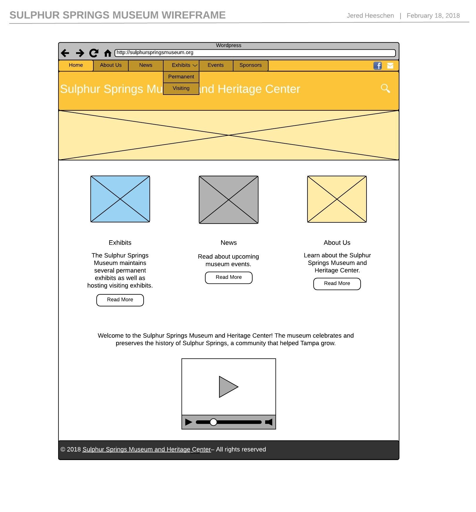
I’m working on a website for the Sulphur Springs Museum for my Senior Capstone project, so I created a wireframe of the site redesign so far. This should be useful for me as I can move elements around and tweak them to see what works before implementing it on the new site.
I used LucidChart to make the wireframe – they offer free accounts to students, and I’ve used the site before.
The wireframe is embedded here (click to enlarge):
You can also view it on the LucidChart website for a closer look.
The goal of the newer site design is to use a more modern aesthetic than what they have now. The top bar will have menus to navigate the site and links to email the museum or visit their Facebook page. Below that is the title of the site, with a search button to the right. Below that will be a rolling image bar that will display images from Sulphur Springs, both historically and modern-day.
Below the rolling image eye-catcher will be images that link to the major informational sections of the site – a list of exhibits, museum news, and a page providing background about the museum. Then at the bottom of the page is a video about the museum – I might change that presentation, for now the video is there to mimic that part of the current site’s design. I plan to replace the video with a map and photo of the museum, then, but don’t want to do that until I talk to the museum director about that design choice.
I wanted to keep the landing page fairly uncluttered overall – the pages with more content will include a sidebar listing recent posts, a calendar of upcoming events, and a link to Google Maps. I feel like a simple landing page will focus people on the elements that would be more likely to hold their attention (like the exhibits), then the pages after that can present more information.