This week the assignment was to plot graphs for a data set using a built-in R function, a function from the lattice package, and a function from the ggplot2 package.
The source code I created for the task can be found on GitHub here:
https://github.com/jered0/lis4930-rpackage/blob/master/module9/lattice-ggplotting.r
I used the SeaSlugs data set. A description of the set is on this page, and the data set itself can be downloaded via this link.
Given that there were two categories of data (time and metamorphose percentage), and there were multiple percentages for each time entry, I decided to represent the data with a boxplot.
Built-in function
I used the built-in boxplot() function to create the first graph.
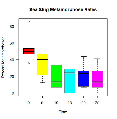
I’ve used this function before, but I did have to fiddle with it to work out how to get the y-axis labels horizontal (I thought it looked better that way), and to apply colors from the rainbow() function. It’s a simple graph, nothing fancy.
Lattice function
I used the bwplot() function from the lattice package to make the next box plot graph.
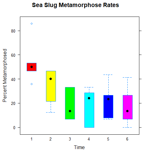
The syntax is pretty close to the built-in function, which made it easier to work with than I expected. I had to tweak settings to get it to use vertical boxes, and had to find the parameter that would set the colors. Unfortunately I didn’t find an option to draw a line instead of use a plot to mark the median, to match the appearance of the other graphs.
ggplot2 function
For the final graph, I used the ggplot2 package’s ggplot(), geom_boxplot(), labs(), and theme_classic() functions in concert.
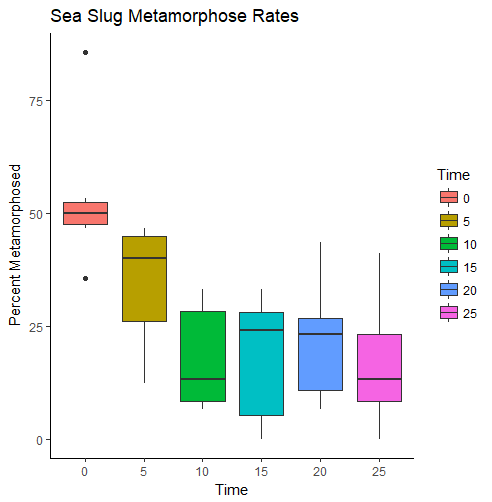
It took some time to get the syntax and everything sorted out, since it uses a different syntax from the other two functions. I also had to convert the Time column to factors – without that change, all the percentage data and time data were collected into one giant boxplot. Definitely not what I wanted.
The ggplot2 graph came out looking the best, I think, and next time there would be less fuss given that I’m more familiar with the package.